


Just thirty years ago software was so rare that you literally had to hunt for it. If something went wrong in the process of installing or using the program, the ancient users had to… figure it out by themselves! Or search for the sacred knowledge on forums, or ask the wise but a little geeky CauseURCoder for help. SaaS didn't exist back then.
Today much has completely changed. The SaaS market has shown steady growth in recent years. Сompetition in the IT sphere is tougher than ever. There are many alternatives both for the programs and ways to learn how to use them. In this race product functionality is critical, but a powerful and effective presentation also can help you to stand out from the competition and succeed.
In a world of product education walkthroughs are a top notch choice to make “Aha!” moments — moments when users feel the real benefit of your app. Here we will talk about:
- The concept of a walkthrough and differences from other in-app tutorials
- What does a good app tour give to your software
- Examples of products with great interactive guides
- Tips for the advantageous app walkthrough
#1 Types of in-app guides

There are several types of application guides. You can use one or combine them — the key to success is to help your users to achieve their goals.
Application walkthroughs
The app walkthrough is an onboarding method that encourages users to participate in the onboarding rather than sit back. In this case the learning process goes along with utilizing the app or program or tool. A successful interactive guide can help fight outflow of users and improve retention rates.
Of course, there are other ways to introduce the software to the utiliser, such as tooltips and product tours. So what's the difference?
Tooltips
Tooltip is a short pop-up description of a tool — it appears when the cursor is on a button or after clicking on the question mark next to it. Basically, tooltips take a passive position and shift the responsibility for learning to the user. It is a good solution for apps with easy-to-navigate interfaces with understandable elements.
Here is a drawback of this approach. If the users are not motivated, if they are not interested in understanding how your application works, they will not dig deep. You will not be able to demonstrate all the capabilities and killer-features of your application to someone who opens the application, doesn’t understand a thing and closes it.

Product tours
Product tours are pretty much the same as walkthroughs, except for a few details. The product tour, despite being less detailed, acts like a real excursion or tour: “On the left you can see the menu button, and on your right there is your personal info”. Whilst the walkthrough takes your hand and closely shows what you should do and what outcome you should expect.
There are some disadvantages of using product tours, like:
- They dump the entire amount of information on an unprepared user, and do not learn-by-doing
- They do not push users to explore and deeply understand the product
- They do not depend on the user's experience and tasks
- They are not interesting

Some may say that users should be able to figure out the features of the application themselves. However, as applications become more complex every day, helping utilisers with your product is a good practice. Many people judge a book by its cover, and it applies to your app as well. Clients expect smooth onboarding when they pass over your app journey. And it’s in your interests to make this process as pleasant as possible — step-by-step walkthrough will help.
#2 Kinds of products utilising app walkthroughs
Marketing experts, analysts and developers are constantly arguing if a user should wise up to the software by himself or not. As we mentioned above, it is better to guide utilisers in an unfamiliar application space. However, the degree of your participation depends on the complexity of your product.
- Consider an application with a simple functionality — Pinterest. It allows to save, share and search for images from around the internet. The only thing Pinterest does for its newcomers is specifies their interests to show them relevant content. What's good about Pinterest’s walkthrough?
- It’s laconic
- It leaves room for discoveries
- It’s basically a checklist with explanations


- There are also more complicated products with wider functionality and rigid structure. In apps with a single correct algorithm of actions that will lead the user to his goal, step-by-step customer walkthrough is the right choice. In this case it is important to work out a map of the user's journey. Slack — messaging and remote teamwork app — handled this task brilliantly.
Onboarding here is welcoming: you can start using the application even without registration complete. Throughout the app tour Slack immerce users into the channels and messaging UI. Since Slack was placed in service, developers are perfecting its walkthrough. As a result we can see that:
- Adaptation can be skipped if it is not needed
- There is a SlackBot — support chatbot
- There are tooltips for basic functions
- Some easy to understand features are left unexplained in order to concentrate the user's attention on less obvious things3. Are you planning to create a complex product that offers many different working options, such as Ableton or After Effects? Then you need to consider several guides that would take into account different scenarios for using your software. It may be:

- Onboarding walkthrough
- Update guide. It will come in handy after adding important and interesting features
- Walkthrough for those who are already familiar with your product, but have not yet reached the level of a pro and need help in mastering complex operations
- Manual for returnees after a break who missed updates and forgot functionality

Now we can say that walkthrough can be useful in many different ways and various fields.
#3 Top 6 Benefits for any business
- Not many SaaS companies use walkthroughs. In this way, manuals will become your competitive advantage.
- When the user learns along the way, he becomes more attached to the product and becomes more interested in further learning. After all, he understood everything and figured out everything by himself. Self-acquired experience is most valued.
- "Aha!” moments are visible immediately. With the help of a step-by-step guide, the user will be able to profit from using the program as quickly as possible — this is how key activation points are highlighted.
- With walkthroughs’ data you can manage your company's marketing growth strategy.
- With the help of guides you can save money by excluding expensive training webinars, and your customers will also be able to save on training courses for their employees.
- If you already have a dedicated fanbase, it's a great possibility to encourage them to try your premium features.

#4 Why do you need an app walkthrough for your very own project?
We have listed the benefits of interactive walkthrough for business, but what does this have to do with your particular startup? Here we will try to cover the topic in more detail.
Caring is attaching
You have been working on your project for a long time, investing energy and resources into it. You know your app like the back of your hand. Therefore all the functions seem obvious, the interface — extremely simple and the project seems to need no walkthrough. But the users may think differently. With interactive guide you will not lose people who find your software unclear and take care of the rest.
Good onboarding makes it easier for customer service
You can offload customer support: just help your users to understand the software on their own with the built-in mechanics and interactive guide. If the journey map is well thought out, it solves the utilizer's questions before they arise. The endless stream of the same type of requests like: "the button disappeared after update!" or "where to find the toolbar?" will almost dry up and support will be able to calmly deal with more serious problems.
Prevent yourself from falling into a Product Death Cycle
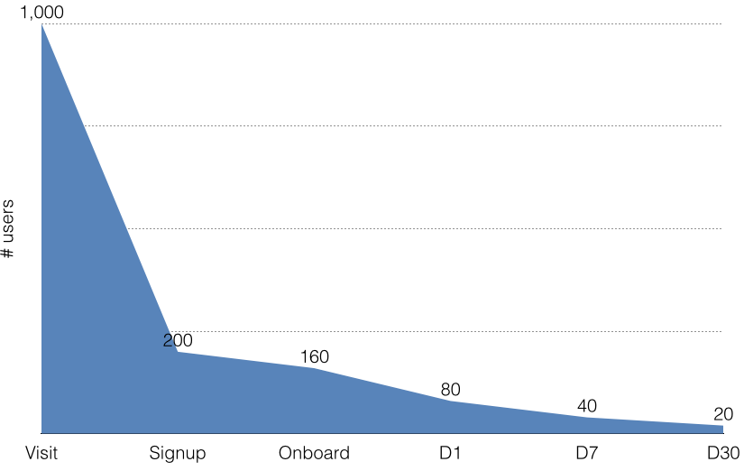
This graph reflects the funnel your audience goes through. Almost 80% of those who see your headline do not make the coveted click, and another 80% of those who land on the site do not complete registration. After several sessions of using the application, the number of users reduces by 10 times. Why is this happening?
Here is one of the basic principles: the beneficial side of your product does not become obvious to new users in the shortest possible time. Too much movement for the reward that is not enough. Software walkthrough helps the user to get the real benefit from the product as quickly as possible. So your chances of falling into a death cycle are reduced.
#5 How to create the best app walkthroughs possible
We finally got to discussing how to make a walkthrough. There are three main stages that you need to get over: preparation, choice of development method and development itself.
Preparation
The first one is preparation within the company. At this stage, you must answer questions which will directly affect your future guide:
- Discover your Unique Selling Proposition (USP);
- Work out a portrait of the user and his “pain points”. Keep in mind that users differ not only by the level of their skills, but also by amount of motivation.
For some, such research may seem unnecessary. However, a quality marketing strategy, an interesting UX and individuality as a competitive advantage — all flow from this initial phase.
Choice of development method
At the next stage a decision should be made: will you create a user walkthrough by yourself or outsource this task. In the first case free walkthrough software is a good choice. To assess whether a particular solution suits you, answer the following questions:
- Is it easy to follow the guides created with the tool?
- Do I need to write additional code to make the manual fit into my system?
- What will be the budget for ordering the manual and for finishing the “out-of-the-box” solution?
- What UI options will my future app tour support?
- How specific and individual the software walkthrough will be?
Be clear-minded about your strengths and capabilities. We hope that the answers to these questions will help you make a choice: design a walkthrough by yourself or put its development under a third-party company's care. In any case, MarbleFlows will help you get the app tutorial of your dreams. We can both develop a walkthrough or provide a Freemium version, so you can make it on your own.
The process of creating software walkthrough
Take a look at the steps you will need to go through if you do decide to create an interactive guide with the help of experts:
- Think about what kind of software walkthrough you want to create:
- function oriented
- benefit oriented
- progressive/action-driven
- Evaluate the UX of your product in its current state. You can use usability tests, feedback forms, interviews and other methods.
- Prepare a user journey map based on the user needs and “pain points” that you identified earlier.
- Don’t forget how it looks and feels. We use such walkthrough UI elements as modals, tips, hot spots, slides to involve the user in the process. These elements will not be useful by themselves, they should appear at the right time and in the right place.
And remember, the best product walkthroughs are:
- Clear. There is simple navigation and language has no terms
- Concise by design and format
- Engaging
- Intuitive — you can use icons and emoji, but they must be understandable
- Skippable
- Contain support
- Now it's time to go ahead with working moments: operation reports, testing and optimizing.
#6 Remarkable app walkthroughs: 3 examples
We've already said a lot about what a good app tutorial should be. But one look is worth a thousand words. Here we have collected products with successful walkthroughs in our opinion. Let’s talk about why we chose them.
Asana
Asana is a project management tool like Basecamp and Trello. Although it’s not as popular as these two — Asana has far more tools than Basecamp and yet remains the interface intelligible unlike Trello. And of course we wouldn’t mention it without a wonderful onboarding. The walkthrough here is combined with the creation of the first task. Thus, it’s brief, action-driven and leaves users with actual results.
Important features of Asana’s walkthrough we recommend to chalk up:
- Concision mixed with effectivity
- Actions user does in the tutorial actually do something right away

Humanity
Staff scheduling software Humanity has extensive functionality helping managers and employees to stay in touch and solve work issues anywhere. And yet, its walkthrough is concentrating on scheduling only as it is the main function. Although, this one function is explained in all details excluding any possibility of misunderstanding.
What can we learn from this product walkthrough example:
- It is longer than we are used to. But at the same time it’s thorough about main features and not boring. Users feel involved thanks to action-driven mechanics
- App walkthrough UI is really good. It uses explanatory pictures, gifs and spotlights so that the walkthrough becomes easy to understand even for those who are new in using such apps and smartphones in general
- It has several stages. The first one we were talking about is mandatory, but the others are skippable and not so deep. They explain functions beyond core functionality


Evernote
Evernote is both a multiplatform and multifunctional app. Making notes, sharing information, editing data — that’s not the full list of things Evernote can do. And its onboarding takes it into account asking the user what he will use the app for. And, depending on the answer, it teaches user things he wants.
What can we learn from this walkthrough:
- It’s oriented on user needs. Indeed, why should you spend time on explaining things the consumer won’t use?
- Again, there are more than one guide in the app, and except for the very first one all of them are optional. Let the user decide if he wants to learn or not


#7 Sum it up. How to make an app walkthrough for successful startup
We hope we succeeded in convincing you that walkthrough is an advantageous solution both for business and users. To bottom-line the whole article, here are some tips to help you on the way of creating your own successful app onboarding experience:
- Make it interactive: use feedback buttons, gamification, app walkthrough videos
- Don't forget to consider different usage scenarios
- Reduce the number of required lines and fields
- Less text instructions, integrate training into real work with the application
- Submit information gradually, do not burden users with hundreds of tips in a row
- Spend more time learning key features
- Converge the reality of your app with user expectations
- Stay customer-centric
This list is far from exhaustive, yet still it will be a solid foundation for a good onboarding. And remember, walkthrough is only bad when it doesn't exist!


